At the recent WWDC 2006 there was a discussion about the need for a simple 2D plotting tool, David Adalsteinsson the author of the scientific visualisation tool DataTank has created DataGraph a 2D plotting tool with the design philosophy “Simple and Powerful Plotting”. On startup the application displays a three pane window, the left hand pane contains the data set being explored, the upper pane the display options and the lower pane the graph display. Across the top of the window are the various graph commands, these are also available from the application menu. The rightmost “Parameters” button opens a side panel giving access to sliders and other interactive manipulation tools.
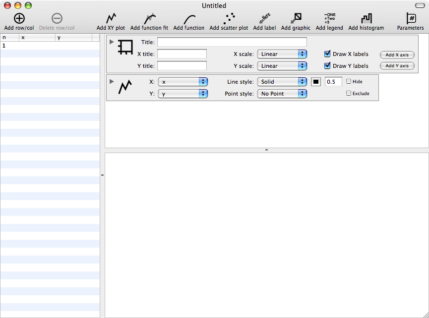
Data can be entered either by typing values into the left hand pane, pasting delimited text (e.g. csv) or by using “Import File” from the “Data” menu. When the data has been imported it is possible to do simple arithmetic manipulations of the data and enter the result in a new column.
To create a plot simply click on the graph type. in this case “Add scatter plot”, select the values for the x and y axes. Click on the disclosure triangle to modify the display style, here you can change the point style (choice of 9), colour and size. The use of inbuilt Mac OS X technologies (colour picker, fonts) means that the program has a very familiar “look and feel” which will benefit new users. The Title, axis labels are all added by simply typing into the relevant text boxes, clicking on the disclosure triangle allows access to the formating options. Clicking on the “Add function fit” allow you fit a line to the data, current options are linear, quadratic, cubic, exponential and power. You can look at the outliers and remove them using the distance function. This can be modified using a slider in the parameters tab allowing you to look at the influence on the fit.
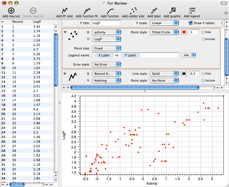
Adding additional scatter plots allows you to compare different properities easily, clicking on “Add legend” automatically adds a colour coded key. Using the “Hide” and “Exclude” check boxes allows you to explore dense data sets easily and inuitively.
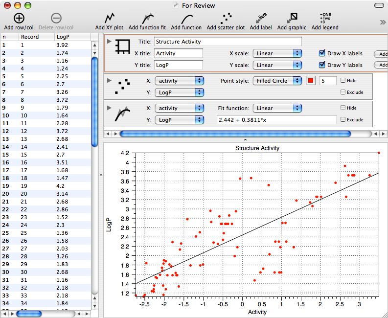
he graphics can be exported in a variety of formats, pdf, png, eps, dtg, tiff (with and without alpha channel) and jpg. Another nice feature is the ability to add labels at specific points on the graph by defining the anchor point using the graph coordinates.
DataPlot can also be used to display mathematical functions, simply click on “Add function” and then type the function into the f(x) text field and the graph will be immediately displayed in the lower pane. The style of the display can be modified in the same manner as described previously. The parameters tab displayed on the right side of the main panel allows the user to actively interact with the displayed graph using the slider.
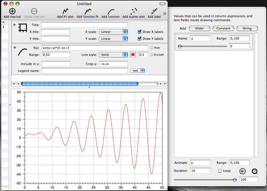
The animated graph can be exported as a Quicktime movie.
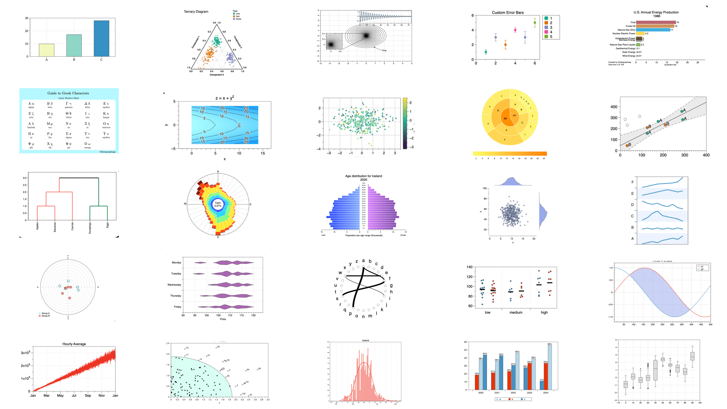
DataGraph supports a huge variety of plotting options

Summary
In summary DataPlot is an excellent data visulisation program with a minimal learning curve. I tested it with a data set of 2500 rows and 100 columns and it performed perfectly. As a beta tester I found David extremely responsive, and I suspect that the level of support will continue to be of a very high standard.
